Showing posts with label shiller. Show all posts

Sunday, March 1, 2020

What did the US Stock market look like during the Spanish Flu?

Stock markets sold off heavily this week due to the fear of the impact of the Coronavirus pandemic on economies, as more and more people stay home, and supply chains are disrupted.

If we look at the S&P 500 over a 3-month period the drop is dramatic.

That's an 11.5% decline in just one week. Look at a chart over a longer period, puts the decline into context.
You can see the 5-year chart for the S&P 500 above. A sharp decline, but nothing too bad, and it could just be a correction. The coronavirus, and associated CODIV-19 disease, is still nothing like the Spanish Flu that infected 500 million people between January 1918 – December 1920 and killed 50 million or about 10% of patients. Hopefully, it won't get that bad, since the virus is highly infectious, there's a chance it gets out of control with millions infected, and the medical system unable to cope.

So I'd like to take us to the past to see how the market behaves during the Spanish flu. Market valuation matters over the long team, so let's check Shiller CAPE chart first.

WWI was still going in early 1918, and markets were already depressed with a CAPE of 6.64 in January 1918, which went all the way down to 4.78 in December 1920, the lowest ever. In the meantime, we are now at much more elevated levels with a CAPE of 30 equivalent to the one at the top of the roaring '20s. So if it does get out of control - which hopefully it won't - we should expect a much sharper drop.

I wanted to check the S&P 500 chart in 2018-2020, but since it was created in 1957, we'll revert to the much older Dow Jones.


That's a drop from 1470.47 points to 956.72 points, or around a 35% drop. It's probably not purely related to the Spanish Flu, and one would have to look at the history of the time, notably, the end of WWI in November 2018 which may help the jump to 1600+ points before the sharp drop.

One way to check the effect of the Spanish Flu is to see if we have a chart of cases, especially in the US since after all, we are looking at the Dow Jones here. Most info is shown on Wikipedia. The first chart is in the UK which shows three waves.

The worst happened in November 1918, and nothing is shown in 1920 at all, so there must have been few cases during that year.


The chart above also shows fatalities in big cities in the USA (New York), as well as in France, the UK, and Germany with all peaking in October-November 1918. If we look at the Dow Jones nothing much happened market-wise during that period, and an article on Seeking Alpha and the related chart shows it clearly.
Source: Seeking Alpha
As we've seen above, markets were already very cheap at the time, and the market situation today is much different with several stock markets clearly overvalued around the world, and globalization was not a thing in 1918-1920.


Monday, February 4, 2013

S&P 500 Analysis: Valuation, Sentiment and Technicals - February 2013 Update

Last time I did this analysis was in January 2012, and I found out the US market was not particularly attractive with the S&P 500 just over 1,300, but not extended quite enough (AAII sentiment) to short it, the S&P 500 is now over 1,500, so let's update this long term analysis.

S&P 500 Valuation

The Shiller S&P 500 CAPE (10-year price earning ratio adjusted for inflation) is the reference to assess whether the S&P 500 is undervalued or overvalued over long periods of time. Here's what it looks like now:


The CAPE stands at 22.77 vs 21.14 over a year ago, so by this metric the S&P 500 is even more overvalued than last year. Although it's still much lower than the CAPE in 2000, it's still high compared to historical CAPE, and at the level of previous tops in the stock market (1901, 1929 and 1966).

Many analysts like to look at the short term, and show that forward PE ratio is only about 14, and use this number to explain stocks are a pretty good bargain right now. In 2007, we had the same rhetoric, as forward PE was low because of high corporate earnings, which were widely above their long term trend.
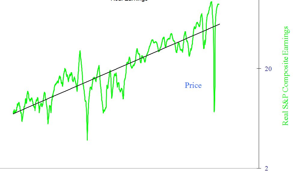
The chart above shows the S&P 500 earning adjust for inflation (real earning) between 1870 and today. We are clearly above trend, and this does not bode well for future returns.

Based on the 2 metrics above, the conclusion is the same as last year and it appears that based on valuation investing in the S&P 500 for the next several years might not be the best of ideas, or least it's rather risky.


US Market Investors Sentiment

Based on last week AAII sentiment survey, investors are moderately bullish for the next 6 months.
But I like to look at the 14-week moving average of the AAII sentiment survey (which I call AAII-14), since I found it to be useful to identify  some of the optimistic (and market) peaks of the past. The rule goes as follows: If the 14-week moving average of the AAII "Bullish" sentiment index is at 30% or below there could be a long term buying opportunity, above 50% there could be a long term sell opportunity.


Now this is getting interesting, as sentiment is pretty bullish, and AAII-14 getting closer to the 50% mark, even though it's not quite there for now.

S&P 500 Technicals

We are now going to have a look at some technical indicators namely RSI-14 and NYA200R, as well as draw trend lines on the S&P 500 to see what it might do in the short term.


The chart above (Yahoo Finance) is the 6 month chart of the S&P 500 with RSI-14, and we've been around 80 for a little while, which means the market is overbought in the short term.

NYA200R shows over 83% of stock are above their 200-day moving average, which is  not very bullish for stocks either
Now let's get back the S&P 500 chart, but this time over 5 years, and let's try to draw bottom and top parallel trend lines.


We seem to have reached the top of the trend started since 2010, so a correction (at least in the short term) could occur very soon.

Conclusion

In the short term, all indicators shown above are bearish since they all indicate the market is overbought, so it's prudent to own less US stock at the moment, and traders may also consider shorting for the next few weeks/months.

In the long term, the S&P 500 is overvalued by all measures, but market participant is not extreme just yet, so there could be a short term correction, followed by a rally before stocks head south for a longer period of times. Alternatively, it's also possible positive sentiment carries on the S&P 500 to new highs, and the long term reversal comes earlier than expected.

Monday, February 13, 2012

Gold Outperformed the S&P 500 For the Period 1965-2012

I've seen an article on Fortune magazine written by Warren Buffett that shows the graphics on the right showing the S&P 500 outperformed Gold since 1965.

Warren Buffett also explained his preference for stocks as follows:

Today the world's gold stock is about 170,000 metric tons. If all of this gold were melded together, it would form a cube of about 68 feet per side. (Picture it fitting comfortably within a baseball infield.) At $1,750 per ounce -- gold's price as I write this -- its value would be about $9.6 trillion. Call this cube pile A.
Let's now create a pile B costing an equal amount. For that, we could buy all U.S. cropland (400 million acres with output of about $200 billion annually), plus 16 Exxon Mobils (the world's most profitable company, one earning more than $40 billion annually). After these purchases, we would have about $1 trillion left over for walking-around money (no sense feeling strapped after this buying binge). Can you imagine an investor with $9.6 trillion selecting pile A over pile B?
A century from now the 400 million acres of farmland will have produced staggering amounts of corn, wheat, cotton, and other crops -- and will continue to produce that valuable bounty, whatever the currency may be. Exxon Mobil will probably have delivered trillions of dollars in dividends to its owners and will also hold assets worth many more trillions (and, remember, you get 16 Exxons). The 170,000 tons of gold will be unchanged in size and still incapable of producing anything. You can fondle the cube, but it will not respond.
Considering peak oil is around the corner, Exxon Mobil may not be the best example ever, as it might be worth zero in 100 years, along with lots of other stocks 9if not all stocks). But let's go back to the subject of the S&P 500 outperforming Gold since 1965. I have edited an excel spreadsheet to calculate the return of the S&P 500 including dividends since 1965 (but excluding fees and taxes) as well the same return with Gold (again excluding premiums and taxes) and drawn the chart shown below (Click to enlarge).

 There are two interesting facts:
  1. Gold and Stocks appear to work in cycles, with period where stocks massively outperform Gold and vice versa. A logarithmic chart would show Gold is just at the onset of this cycle and should go much higher vs. stocks in the S&P 500. So there is no "Gold is better than Stocks' or "Stocks are better than Gold", there are just wealth cycles.
  2. If I find the same result as Fortune for Gold appreciation since 1965, I just find 100 US dollars invested in the S&P 500 in 1965 would have returned 3370 USD whereas Fortune found those 100 USD would have turn into 6072 USD. I also reinvested dividend (at the end of the year) in stocks for each year.
Either my data is wrong or the way I calculated is incorrect. I used the S&P 500 price and dividends data by Robert Shiller (averaged per year) and for Gold I used both Kitco and Goldinfo.net.
For the formulas, you can check the S&P 500 vs Gold - 1965 - 2000 Spreadsheet.

So if I'm correct, Gold clearly outperformed the S&P 500 (including dividends) during that period. To be fair, if they had chosen 1950 has the starting we may have a different story.

Saturday, January 28, 2012

US Markets Valuation, Sentiment and Technical Analysis - January 2012

In recent weeks, the S&P 500 has performed very well, almost reaching 2011 highs. At the same time, several indicators would seem to indicate a recession is coming to the US in 2012 and the Baltic dry Index does not look good either.

Today, I'm going to look at US markets, both in terms of valuation and sentiment. I will also look into technical factors to help determine whether it is a good time to sell or even short US markets.

S&P 500 Valuation.

For long term investors, Shiller S&P 500 CAPE (10-year price earning ratio adjusted for inflation) is the reference to assess whether the S&P 500 is undervalued or overvalued. Here's what it looks like today:

 The CAPE stands at 21.14, it's much lower than the CAPE in 2000 (That is when Shiller talked about "irrational exuberance"), but still high compared to historical CAPE (average is around 15-16).

Another way, I like to look at valuation is by looking at earnings only. Historically, they've had a tendency to increase at a fix rate over long period of time and always oscillate around the trend line. That's the "mean reversion" preached by Jeremy Grantham. Here's the logarithmic chart of S&P 500 inflation-adjusted earnings between 1870 and 2012.

In 2011, earnings are above average and will revert to the mean at some point. Of course this could be this year or in several years.

Based on the 2 metrics above, it seems that based on valuation it is rather risky to invest in the S&P 500 or at least it's likely to average disappointing returns.

US Market Investors Sentiment.

Previously I liked to follow Market Harmonics Bull/Bear ratio, but it is not a free service anymore since last April. Now, I use the AAII sentiment index instead:
 Week ending 1/25/2012

Bullish 48.4%
up 1.2
Neutral 32.7%
up 3.5
Bearish 18.9%
down 4.7


According the AAII, the long term average are as follows: Bullish: 39%,  Neutral: 31% and  Bearish: 30%.
That shows people are now pretty optimist about the future. As a contrarian, that would be a bearish sign.

However, I like to look at things in a longer term perspective using AAII-14, as explained in my post "Using AAII Sentiment Survey to Time the Market". If the 14-week moving average of the AAII "Bullish" sentiment index is at 30% or below is a long term buy, above 50% it is a long term sell.
Now the AAII-14 is at about 42%, so this is neutral.

S&P 500 Technicals.

I'm now going to look at my 2 favorites technical metrics the RSI-14 and the index showing the percentage of stocks above their 200-day moving average (NYA200R).


I use the 14-day relative strength index moving average for short term moves.


The S&P 500 6-month chart and RSI-14 chart (Source: Yahoo Finance) shows it is now at 76.20. On the 23rd of January the RSI-14 was at 87.57 which was overbought, so a short term correction should be expected.

The NYA200R is really the index which tell me "wait" when other indicators tell me to buy or sell. Here's what it looks like today. (Source: StockCharts.com)

At 65.10%, the NYA200R tells me there is probably more upside potential for the S&P 500. I would become wary of holding stocks if it reached 80% or more for several weeks/month.

Conclusion

As some indicators suggest, there are significant recession risks for 2012. The S&P 500 seems relatively overvalued compared to historical ratios. Short term investors are very bullish and the market is overbought. However, longer term, it appears we have to not reached extreme bullishness (as the AAII-14 implies) and the NYA200R would suggest stocks have still more upside.

Based on this analysis, I would personally not add any position at the moment because of valuation and short-term bullishness and would even consider decreasing exposure to US stocks. I would not short the market however, because not all indicators are extreme and we have mad men (e.g. Ben Bernanke) and women (e.g. Janet Yellen) at the head of the US federal reserve that could unleash QE3 after announcing zero interest rates until 2014 since week.