Showing posts with label stock market. Show all posts

Sunday, August 23, 2020

GMO Forecast July 2020 - Emerging Value is the Only Game in Town

 GMO published their latest 7-year forecast for July 2020, and most asset classes have dismissal expected returns over the next seven years from US large stocks to emerging stocks and large and small international stocks. Let's not even get started with bonds that are just as bad.

While we would consider gold, silver and other so-called real assets to be a potentially good long term investments at this point in time, those are not tracked by GMO, but we've noticed one exception in GMO chart: Emerging value.

9.2% yearly returns over seven would be an excellent investment in those days and age, but as we can see GMO separates emerging and emerging value, so we can't just buy any emerging stocks trackers.

But what's a value stock exactly? Here's Investopedia definition:

A value stock is a security trading at a lower price than what the company’s performance may otherwise indicate. Investors in value stocks attempt to capitalize on inefficiencies in the market, since the price of the underlying equity may not match the company’s performance.

They are often opposed to Growth stocks, often referring to stocks in the Technology and Biotechnology sectors with very high P/E ratios.

 Investopedia main takeaways:

  • Common characteristics of value stocks include high dividend yield, low P/B ratio and/or a low P/E ratio.
  • A value stock typically has a bargain-price as investors see the company as unfavorable in the marketplace.
  • A value stock typically has an equity price lower than stock prices of companies in the same industry.

So value stocks may be dividend stocks with low price-to-book and low price-earning ratio. This includes utilities, banks, consumer staples, and some commodities producers.

So our best bet would be to find value stocks in undervalued emerging markets, which last time we looked included Russia, China, Turkey, Hungary, and South Korea. With Russia, it's easy as most stocks are value stocks, and we could just add a Russia ETF to our portfolio such as MSCI Russia Capped Index (3027.HK) in Hong Kong and VANECK VECTORS/RUSSIA ETF (RSX) in the US.

China is more complex since the stock indexes include highly priced technology company such as Tencent, Allibaba and Baidu. One such option is Value China ETF (3046.HK) whose top holdings include Chinese banks, real-estate companies and insurances.

All companies are listed in the Hong Kong stock market. Alternatively, there's also Value China A-Share ETF (3095 HK) with companies listed in China, and more of a Chinese consumers story with 35% Consumer Goods, 34% Financials.

Note that while Google Finance shows there's no dividend paid out, you'd get ~2% dividend paid out yearly.

I had more of a struggle finding a China value stock in North America, and one of the closest would be Horizons China High Dividend Yield Index ETF (HCN.TO) listed in Canada.

The funds distributed dividends every quarter. The current is 6.77% based on info from Yahoo Finance.

I will not look into Turkey due to geopolitical risks at the moment, nor the smaller Hungary market, and complete this post by checking out South Korea. If you want to invest in South Korea, there's limited choice when it comes to South Korea ETF, and most people will not be able to purchase stocks on the KOSPI exchange.

That means we'd have to accept getting some experience to technology stocks like Samsung Electronics (PE: 17.49, DY: 2.53%), Naver (PE: 64.40, DY: 0.12%),  or  SKHynix (PE:22.3, DY: 1.34%) through South Kora ETF such as iShares MSCI South Korea Index Fund (EWI). 


In any case, I'm uncomfortable purchasing stocks in the September-October months due to the high-valuation in the US stock market, and a stock market sell off in the US, may lead to a rise in the US dollars, and a sharp drop in emerging stock markets. If it does happen, it will certainly be an interesting buying opportunity. 


Sunday, July 19, 2020

Long Term Charts - Thai Stock Market (Thai SET) Update - July 2020

It's been a long time since I've not provided an update to long term charts of the Thai stock market. More exactly over 5 years, because to be honest nothing much happened during those years, but we've got a bit more action this year, so it might be a good time to have another look.

Long Term Chart Thai SET 1976 - 2020

The Thai stock market peaked at around 1,830 in February 2018, and it dropped to under 1,200 in March following the politician answers and lockdowns due to COVID-19. It's back to around 1,350 since them It was a sharp, but let's check more long term charts to find out more about valuations.
Thai SET PER - 1976 - 2020

One metric is the price earning ratio, and never really went under 10 that historically is a buying opportunity. Getting to 5 or under would be a lifetime buying opportunity, but obviously it does not happen often. We should also expect earnings to drop significantly, and I'm not convinced they'll recoever that quickly so the PER should soon go higher, unless the average price of stocks in the Thai SET goes down as well.


Thai SET Price-to-Book Value - 1988 - 2020

The price to book value ratio is fairly affordable, so that's one metric where the Thai SET looks fair valued or even slightly inexpensive.

Thai SET Dividend Yield - 1988 to 2020

From the chart above, a dividend yield of just under 4% look attractive considering current interest rate on fixed deposits are under 1%. Buying large stocks for dividends might be a good way to be paid to wait with limited downside. That would remain true as long as dividends are not cut, and that's not guaranteed considering the environment we live in.

But no buying on my side for now, so I'll be patient, and since I expect the market to move again this year, I'll likely post an update in December.

Saturday, June 27, 2020

The Most Important Chart for Stock Market Investors in 2020

I'm so old I can remember from fundamentals and technical analysis were relevant, but this is 2020, and the most important for stock market investors may well be the chart representing the total assets of the federal reserve.

Federal Reserve Assets Chart

Back in September and October 2008, the federal reserve reacted promptly to the bankruptcy of Lehman Brothers, but it was not until March 2009 before the market bottomed out. Since the the balance sheet has gone up with QE 2, QE 3 and operating twist, and it's only when the Federal Reserve Bank started to tamper in 2018 that the stock market become much more volatile, and the FED had to reserve course. The response to COVID-19 sent the assets into the stratosphere, so let's see how it correlates to the S&P 500.

FED reserves 2020

S&P 500 2020 Chart

The FED assets purchase started the week of March 17th, soon after the stock market bottomed out on March 24th, and the S&P 500 went up as long as the FED was purchasing assets. Since then the FED has mostly stopped purchases, and as soon as they started to lower their assets, the S&P 500 followed through.

That means the stock market is highly correlated to the FED's actions, and the rally we've seen since March 23rd may be entirely due to the FED. We should then closely follow the actions of the FED and other central banks for the future direction of the stock market. However, if they overdo it, there may eventually be a currency crisis of some sort. We live in interesting times.


Sunday, June 14, 2020

Investing using GMO 7-Year Market Forecast

You should always check multiple indicators before investing in a particular asset class or country, and one of those I like to follow is Jeremy Grantham's GMO 7-Year market forecast based on "return-to-the-mean" valuations.

The latest was published on April 30, 2020.

GMO 7-year Forecast April 2020


That means large U.S caps should return a real negative 3.6% per year over the next seven years with 2.2% US annual inflation. Or around negative 1.4% per year once inflation is taking into account, while emerging stocks should return 3.5% per year plus inflation (no assumption for non-US asset classes).

So how well does not indicator actually work? It's clear it's not an exact timing tool, as it will likely be incorrect during a bull market, and become right once a bear market occurs. But let's check about past 7-year forecasts, namely:

  1. GMO 7-year forecast Q1 2011 with a -2.8% annual return forecast for small U.S caps.

  2. GMO 7-Year Asset Class Forecasts - October 2012 with a -0.3% annual return forecast for large U.S. caps.

I'm not sure which indices GMO is using exactly, but I'll go with the S&P SmallCap 600 Index (S&P 600) and Dow Jones Industrial Average (DJI) respectively.
S&P 600
Source: Investing.com

The S&P 600 was at 457.95 points on April 1, 2011. With a -2.8% real annual return, plus 2.2% inflation, the S&P 600 should have been at 439 points on April 1, 2018 with a return to the mean. But the actual level of the S&P 600 was about 947 points.It still did not happen two years later, but maybe latter the year, or next, as the US market is very much overvalued.

Let's switch to the Dow Jones now for October 1, 2012 and October 1, 2019.
Dow Jones 2012-2019

The Dow Jones was at 13,096 points on the October 1, 2012. A -0.3% real annual return with 2.2% inflation would mean the index should have been at
14,960 points on October 1, 2019 assuming a return to the mean. Actual Dow Jones level on October 1, 2019: 25,605 points. It did not work too well either for large caps, but I believe that's yet another indicator that US stocks are vastly overvalued. How long the craziness will last is for anyone to guess.


Sunday, May 31, 2020

The Case for Stocks Going Higher - Retail Investors are Still Bearish

As we covered previously, there are plenty of metrics screaming the US stock market is in lalaland as one of the most overvalued markets (even before COVID-19), a complete disconnect between the economy and the stock market with the Wilshire 5000 to GDP ratio - aka Buffet Indicator - expected to reach around 230% by the end of July with the first Q2 GDP numbers.

When we asked whether the stock market rally was over on May 3rd, we noted the 1929 stock market rally took several months and our 1929 Redux simulation would take to it to May/June. We also pointed out one metric suggested it may have more legs: the AAII sentiment survey, or the bullishness/bearishness of the retail investor. We did not look into it too much at the time, so let's do that today by first looking at a 1998 to 2015 chart of the AAII bullishness 8-week moving average data courtesy of investing.com.


We can see every time the chart sharply drops below 25% it has been a buying opportunity. If you don't quite remember what the S&P 500 looks like for the period I have reproduced it below...

There were plenty of times when the ratio went under 30% between 1988 and 1994, and if you had purchased stock during that period you would have done well. Same thing for 2003 and 2009. In 2015, stocks may have looked overpriced, but the index was at around 2,000 points, and in May 31, 2020, the index is priced at around 3,000 or a 50% gain.

So what does the 8-week moving average of the AAII bullish sentiment index looks like today? Ycharts provides a free 5-year chart updating weekly for use to check.


At the time of the 2016 presidential election, the index was at 25%, a buying opportunity based on this index. But at the time, I was personally really wary of buying US stocks considering the length of the bull market, and other metrics.

What about today? The index stands at 29.50%, so retail investors are fairly bearish although not extremely so. Almost everything else cries "sell!!!", but the AAII sentiment survey tells me to wait a little longer, or strangely enough there should even be a buying opportunity, but I'd like to give it a pass.

Also, remember that's a presidential election year in the US, so politicians in power won't be shy to spend money they don't have, as we've seen in recent months in order to keep the system going, and are greatly helped with the federal reserve with their unlimited buying power.  Could they just throw enough money at the system to keep it going for 5 more months until the election? I don't know but would not rule out the possibility.

While AAII sentiment survey looks useful to spot buying opportunity, it does not seem to be a good timing indicator for selling stocks. In 2000, it works, but was completely useless for the 2007 peak, and would have made people sell their stocks later in 2004, and in 2011 with bull markets in their early stages.


Sunday, April 19, 2020

All is Well! FAANG Stocks Hit All Times High as the Economy Collapses

The economy is in shamble with predictions of 20%+ drop in Q2 GDP and so far 22 million people filing for unemployment in the US in the last four weeks, but the market acts as if nothing happened with the NASDAQ positive for the year.
A lot of it as to do with the various government stimulus, FED balance sheet going through the roof, as well as more demand from companies providing services for the many "work from home" (WFH) workers due to lockdowns.

But if we look into the details it's not that pretty, as FAANG stocks are responsible for most of the rise. In other words, it's not a broad market rally, and many NASDAQ stocks are still way down.

From a historical perspective, most bear markets will have a bear market rally, as shown from the S&P 500 chart below between 1998 and 2020. Source: NorthmanTrader.


You could always say "but Dark Horse, 2020 won't be like the great depression, and instead, it's just like 1987, we had the "best economy ever" and it's all up from here after everybody goes back to work + FED put!". To that argument, I'd answer the market was not overextended in 1987 as shown by the market cap to GDP ratio aka "buffer indicator".
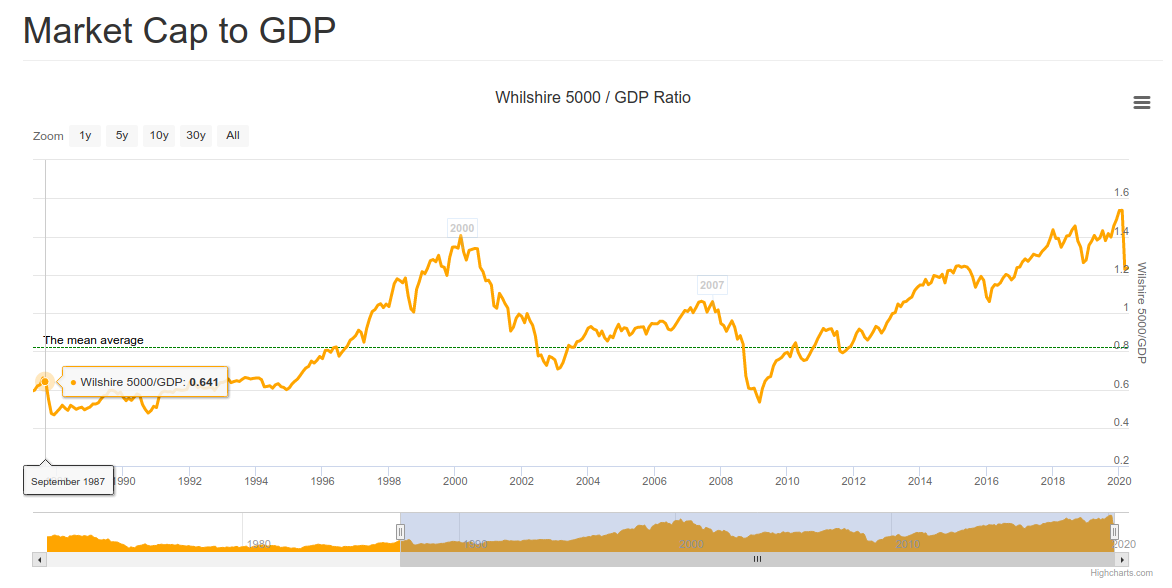
Before the crash in 1987, the market cap to GDP was just 64%, and now it's around 130% before dismissal GDP numbers are announced meaning it should be above the previous record soon.

I'm a big believer in mean reversion of things like market cap to GDP and PER ratio / CAPE ratio. We previously wrote how many markets were overvalued including the US markets, and GMO just released their quarterly update with their expectations of yearly returns for various markets over a 7-year period.

That means large US stocks may lose around 1.5% a year over the next seven years, not a nice proposition especially when considering those numbers were after the correction in March 2020. Also note bonds don't look to be a good place to hide either, but emerging value stocks have some good prospects, and we previously mentioned that Chinese commodity producers may be a place to look for investment opportunities.

I'd still stay very prudent here as there are many risks around. We are quite surprised people expect a vaccine by 12 to 18 months, as we would like to remind our readers that some virus-induced diseases don't have a vaccine, think AIDS or dengue fever. The latter is even scarier because you don't develop immunity, and instead, the risk of death is greater the second time, and even more the third time. There have been reports that released COVID-19 patients have contracted the disease again, so herd immunity is not even a given, but so far there's no indication that the second infection is nastier like for dengue fever.

Stay safe! We live in scary times for our health, finances, and freedom from governments.

Sunday, March 15, 2020

Overvalued Markets (March 2020) - Top 10 Countries

Last week we wrote about the top 10 undervalued stock markets using data from StarCapital AG. Data is up-to-date as of February 28th, 2020, and markets went through interesting gyrations in the last two weeks, to say the least.

But let's go ahead anyway with a list of the top 10 overvalued markets based on metrics such as CAPE (Cost Adjusted Price Earning Ratio), average dividend yield, price-to-book ratio, and price-to-sales-ratio.

Here's the list of the top ten most undervalued markets as of March 2020.


Indonesia was the most expensive at the time, followed by the United States, India, New Zealand, Denmark, as well as Australia, Brazil, the Netherlands, Belgium, South Africa, and Switzerland. Most have experienced a sharp 20 to 30% drop in the last two weeks, Let's have a look at the 10-year charts of the largest markets, namely the United States, India, and Australia, using Trading Economics as the source.


The S&P 500 has a CAPE of around 28 before the drop. It went down as low as 2,400 points this week but ended the week at 2,711 points. Even with the drop of around 20%, the CAPE is still well over 20 historically speaking is considering to be overvalued for the US market. To get into undervalued territories, we'd have to go with a CAPE of under 10 which means the S&P 500 under 1,000 points at current levels. Note earnings are likely to sharply drop in the next quarters due to the reaction to the coronavirus outbreak.


 Another way to look at the long term valuation of the stock market is to check the valuation against the GDP. The Whilshire 5000 to GDP ratio (source: longtermtrends) is around 1.2 right now well above the historical average of ~0.8. If we ever went back to the ratio reached in 2009, the S&P 500 would be around 1,200 points.


Moving to India's stock market with the 10-year chart of the SENSEX shows the recent drop in perspective with the market still doubling since the lows in 2012. If we look at the 2008 lows when the SENSEX was at around 9,000 it nearly quadrupled in 12 years. If earnings grow at that pace that's not an issue, but the rise was also due to an expansion to the price-earning ratio which led to the overvaluation of the market.


The Australia S&P/ASX 200 stock market index does not look as extended as the other two. The CAPE was 18.7 at the end of February, and the sharp drop have brought it down just under 15. We don't have historical information about the Australian CAPE, but it's clearly not in undervaluation territories. Another measure to look at is the PB (Price-to-Book) ratio which was at 2.0, and undervalued markets are often around or even under 1. 

It normally takes one to two years for a bear market to bring valuations to fair value or undervalued, and Charles Nenner, a market cycles specialist, expects markets to bottom out at the end of 2021. Note that shorting stocks may be very risky due to the central bank involvement in markets (if they print enough, stocks will go higher no matter what), and purchasing bear ETFs often have very high associated costs.

Despite globalization, not all markets move in unison and some of the undervalued markets we pointed out last week start to have interesting valuation although it may pay to be patient. I'd see further weakness in Russia, Singapore, Austria, and South Korea as a potential buying opportunity once the situation with the Coronavirus become a little more clear.


Saturday, March 7, 2020

Undervalued Markets in March 2020 - Top 10 Countries

Value and contrarian investors will always look for undervalued and unloved markets or stocks, and one tool I like to use to find out which market may be worth looking into is Starcapital stock market valuation that ranks different countries based on their CAPE (Cost Adjusted Price Earning Ratio), average dividend yield, price-to-book ratio, and price-to-sales-ratio. They also show RS26 (26-weeks relative strength) and RS52 ratio to show which markets were oversold or overbought in respectively the last 6 months and the last year.

This is what the map looks like on February 28, 2020 with countries in blue being undervalued, and the ones in red being overvalued using CAPE as reference.


Russia, Turkey, Poland, Oman looks to be quite undervalued using this metric, while the US, Ireland, Switzerland, New Zeland, and Finland are overvalued.

Here's the top ten list of the most undervalued markets as of March 2020.


That's Russia, China, Italy, Spain, Singapore, Turkey, Austria, South Korea, Portugal, and Hungary.

Starcapital does not use the CAPE as the only metric to rank to the country with average PC (Price-to-cashflow), PB (Price-to-book), and PS (Price-to-sales) ratios. To find out if the CAPE is undervalued, one needs to look at the long term ratio for each country, and the ratio can not be compared between countries because each stock market has different types of companies. For example, Russia will have a large share of companies related to the oil business which command a lower price-earning ratio. Sadly, the company does not provide its historical data, so I'll just trust its color scheme for that part.

If the price-to-book ratio is lower than one, that means the stock price is cheaper than the book value, and it's always a good metric to check you don't overpay for a stock or market. If the dividend yield is fairly high, that's often a sign, stocks are undervalued as well.

I view the relative strength index more as a timing tool, as it shows whether the stocks for a given country were sold or bought during the time period. Starcapital allows to filter results as well, and I often set PB to one or lower, and RS26 to a value under one (e.g. 0.94).


That leaves us with 5 countries: Russia, Singapore, Austria, South Korea, and Poland. The next step is to look at mid-term charts (e.g. 10 years) to see how stocks performed. I like to use trading economics.


The Russian stock market did very well in the last 6 years, and we did buy a Russian ETF (3027.HK) in 2014-2015, and sold in October/November 2019. It went up further since then, but a correction happened due to the Coronavirus panic. If the market corrects further it could be a nice entry point.


The Singapore stock market (STI) has been trading in the 2600-3500 range in the last ten years, so if it goes back to 2700 points it may be an interesting entry point. Looking at an even longer-term chart, we can see the market performed fairly well since 2002, but as a smaller country, it may suffer more in downturns.

Next up is the Austria stock market (ATX), which we can see went down for over 2 years.
Looking at the chart since 2001, we can see the ATX never covered in a big way from the GFC (Global Financial Crisis) in 2008.
It's almost 50% below its all-time high in 2017..., and if we look at the long term bottom trend we could go a line showing there may be opportunities right now. I still feel uneasy investing in Europe due to structural issues with the Euros though.


The 10-year chart of the KOSPI (South Korean stock market) shows the index did not return much over the last ten years, and long term bull markets are often born from a long bottoming process.

To balance that, the KOSPI did really well in the first decade of this century, quadrupling from 500 points to over 200 points in 2007, but 13 years later we are still at the same point. It's been a long wait for investors who are still getting a 2.3% dividend yield at this time.

Let's finish with the Polish stock market (WIG). The last two years have been brutal which should explain why it's now considered an undervalued stock market.
It seems to be at the bottom of the trends (using a line passing through 2012 and 2016 bottoms), but the 20-year chart shows again the great performance of emerging markets in the 2000's.
Yet the WIG is still well below its all-time high in 2017. All those five markets look interesting, in the short term are likely to be affected by the impact of the Coronavirus outbreak, the policy decisions of central banks and government around the world, and potentially the health of the US stock market which looks to be extended at this time, but we'll look into the later in a subsequent post

Sunday, March 1, 2020

What did the US Stock market look like during the Spanish Flu?

Stock markets sold off heavily this week due to the fear of the impact of the Coronavirus pandemic on economies, as more and more people stay home, and supply chains are disrupted.

If we look at the S&P 500 over a 3-month period the drop is dramatic.

That's an 11.5% decline in just one week. Look at a chart over a longer period, puts the decline into context.
You can see the 5-year chart for the S&P 500 above. A sharp decline, but nothing too bad, and it could just be a correction. The coronavirus, and associated CODIV-19 disease, is still nothing like the Spanish Flu that infected 500 million people between January 1918 – December 1920 and killed 50 million or about 10% of patients. Hopefully, it won't get that bad, since the virus is highly infectious, there's a chance it gets out of control with millions infected, and the medical system unable to cope.

So I'd like to take us to the past to see how the market behaves during the Spanish flu. Market valuation matters over the long team, so let's check Shiller CAPE chart first.

WWI was still going in early 1918, and markets were already depressed with a CAPE of 6.64 in January 1918, which went all the way down to 4.78 in December 1920, the lowest ever. In the meantime, we are now at much more elevated levels with a CAPE of 30 equivalent to the one at the top of the roaring '20s. So if it does get out of control - which hopefully it won't - we should expect a much sharper drop.

I wanted to check the S&P 500 chart in 2018-2020, but since it was created in 1957, we'll revert to the much older Dow Jones.


That's a drop from 1470.47 points to 956.72 points, or around a 35% drop. It's probably not purely related to the Spanish Flu, and one would have to look at the history of the time, notably, the end of WWI in November 2018 which may help the jump to 1600+ points before the sharp drop.

One way to check the effect of the Spanish Flu is to see if we have a chart of cases, especially in the US since after all, we are looking at the Dow Jones here. Most info is shown on Wikipedia. The first chart is in the UK which shows three waves.

The worst happened in November 1918, and nothing is shown in 1920 at all, so there must have been few cases during that year.


The chart above also shows fatalities in big cities in the USA (New York), as well as in France, the UK, and Germany with all peaking in October-November 1918. If we look at the Dow Jones nothing much happened market-wise during that period, and an article on Seeking Alpha and the related chart shows it clearly.
Source: Seeking Alpha
As we've seen above, markets were already very cheap at the time, and the market situation today is much different with several stock markets clearly overvalued around the world, and globalization was not a thing in 1918-1920.


Sunday, February 16, 2020

Financial Fraud: AirBnB and Virgin Hyperloop One Pre-IPO Scams

You may have read in the news that fairly large private companies like AirBnB and Virgin Hyperloop One may consider launching an IPO (Initial Public Offering). Some scammers have decided to make a buck and launched several websites, opened companies across the world in 2019, and set up call centers.

[Update June 2, 2020: The scammers have also diversified their stock offerings with scams now also involving:

PRMW - Primo Water Corporation
ZM - Zoom Video Communications, Inc.]

How Does that Work?

The scammers manage to get your phone number, name, and email address from sources that may include a website where you have expressed your interest.

A person speaking perfect English and that sounds knowledgeable with financial matters then calls pitching the unique opportunity to invest in Virgin Hyperloop One IPO (actually Pre-IPO), for instance. Most people will be wary, but then they provide you with a credible company website, including registration numbers from the Bank of Ireland that seem to match, and some information about the IPO. They let you some time to think about it, and then come back the next day where they can complete the deal.

You'll then receive an email with account opening documents, online account access, invoice for the amount you want to invest in, and of course, the W-8 form since the IPO takes place in the US. You'll talk to another employee/scammer to confirm your details. Note that we were told you'll never be asked your passport, a clear red flag.


You'll notice the company where you're asked to pay the invoice to is different from the company promoting the pre-IPO, but they'll tell you it's safer to use a third-party as Escrow to confirm payment for both sides. It's also in a different country.


Once payment is received, you'll get an official receipt, and can log into your account, and your shares will be visible. They'll then call you from time to time, maybe once to twice a month to explain everything goes well, and the IPO should occur in Q1 or Q2 2020 as expected. One day, a call is different, as they'll pitch another stock with a unique opportunity of a positive liquidation scheduled to close in about 45 days. You'll buy some shares now, and in 45 days you more than double your investment. This is a unique opportunity, does not happen very often, and is basically risk-free.

If you decide to invest again, and then be contacted from time to time to keep you updated, and when the time to sell has come, they'll call you to inform you there are some options to purchase for a fraction of the price, and you'll quadruple your initial investment. If you refuse, they'll come back a few days later, saying the sale is complete, and provide with an obviously fake NASDAQ receipt (PDF generated from Excel file) saying you need to purchase mandatory preferred shares to release the funds.


Fake Companies/Websites/Names, Real Companies, and Bank Accounts

So who are those people? We don't exactly, but we do know they are using possibly fake companies, fake names with the phone scammers having some heavy turnaround, as well as real companies that opened last year and are used to funnel the money.

"Fake" companies & websites used:

Van Gossum Consult (“VGC”) 


Singapore: One Raffles Place, Tower 2, 1 Raffles Place #27-62 S048616 London: 110 Bishopsgate, London, EC2N 4AY Hong Kong: International Finance Centre, 8 Finance Street, Central, Hong Kong 

St Johns Asset Management (“SJAM”). 

website: www.stjohnsasset.com

Office#: 386-385-5915
Address: 601 St. Johns Avenue Palatka, FL 32177, USA

Crest Security Contracts Ltd

The company was related to the two other companies listed above and has now alledgedly closed due to a lawsuit.

Brookfield Investment Funds Plc 

website: brookfieldinvestmentfundsplc.net
main email: accounts@brookfieldinvestmentfundsplc.net

Office addresses:

Others

You'll find many others companies related to AirBnB pre-IPO scam. Luxstar Asset Management, based in Luxembourg, specifically asks payments to Kaloca Inc, for which we have more details below.

We know of three companies and bank accounts used to transfer funds, but there may be more:

Account Name: VIPCO Holdings Pte.Ltd.
Account address:
11 Keng Cheow Street
No. 02‐11 Riverside
Piazza
Singapore 059608
Account Number: 503 534 950 301
Bank Name: OCBC Bank Singapore
Bank address:
65 Chulia St.,
OCBC Centre,
Singapore 049514
Swift Code: OCBCSGSG

Incorporated in February 2019.

Account Name: Law Office: John Jennings
Account Address: 40213 Duesseldorf, Germany
Account Number: DE34 7001 0080 0097 3868 04
Bank Name: Postbank
Bank Address: Essen, Germany
Swift Code: PBNKDEFF

Very hard to find information about that one. It looks like an individual, instead of a law office.

Account Name: KALOCA INC.

Account Address:
2177 Buckingham Rd.,
Suite 567,
Richardson, TX 75081
Account Number: 4880 7336 0881
Bank Name: Bank of America
Bank Address:
100 N. Tryon St.
Charlotte, NC 28255
USA
Swift Code: BOFAUS3N
ABA/Routing Number: 026009593


The company was incorporated in 2019.

Some of the (likely) fake names and positions of the scammers include:

Mr. Jason Taylor, Investment Adviser
Carl Bryce, Director of Finance
Damian Williams, Director of Mergers & Acquisitions
David Billington, Accounts Department
Keith Armitage, President
Greg Ellis, Account Services.
Ian Simms, Senior Market Strategist
David Scott, Finance Manager
Daniel Parker, Investment Advisor
Melissa Keating, Accounts

Some of the phone numbers used to call victims: +35314126374, +35314124540, +44(0)1702623754, +442076601459, "private numbers", and local phones numbers which all have called barring enabled meaning they can call you, but you can't call back

I've been scammed! What can I do?

First, stay calm, and if they call you again just pretend you are still interested, just in case the police need more information. You could also install call recording apps such ACR call record provided it's legal in your home country.

Then fill a report to your local police station. You could also fill a report to the authorities of the country where you transferred the funds.

For VIPCO Holdings Pte. Ltd. in Singapore, you can fill a report online to the Singapore Police Force using their iWitness website. Alternatively, you could call the Commercial Affairs Department directly: +65 6325 0000.

For "Law Office: John Jennings" in Germany or other countries in Europe, you can follow the links from Europol website.

For KALACO Inc. in the US, you could contact the FBI in one of their offices in the US or overseas.

You could also contact a lawyer, but this would likely only work if the amount is really significant. Working on international cybercrime is a complex and slow process with the involvement of the authorities of multiple counties, certified translations, bank records, lots of documents and so on.

SafeorScam website also reported on such scams, and they offer services to help to recover the funds. However, we never worked with the company, and can't vouch for them, just make sure not to throw good money after bad.

To be honest, the chance of recovering funds is slim, as the money probably left the country where the money was transferred and spent on third parties. But it still worth a try, and the people responsible for the scam must be held accountable and spend a few years in jail. This will also prevent more victims.