Showing posts with label dow jones. Show all posts

Sunday, June 14, 2020

Investing using GMO 7-Year Market Forecast

You should always check multiple indicators before investing in a particular asset class or country, and one of those I like to follow is Jeremy Grantham's GMO 7-Year market forecast based on "return-to-the-mean" valuations.

The latest was published on April 30, 2020.

GMO 7-year Forecast April 2020


That means large U.S caps should return a real negative 3.6% per year over the next seven years with 2.2% US annual inflation. Or around negative 1.4% per year once inflation is taking into account, while emerging stocks should return 3.5% per year plus inflation (no assumption for non-US asset classes).

So how well does not indicator actually work? It's clear it's not an exact timing tool, as it will likely be incorrect during a bull market, and become right once a bear market occurs. But let's check about past 7-year forecasts, namely:

  1. GMO 7-year forecast Q1 2011 with a -2.8% annual return forecast for small U.S caps.

  2. GMO 7-Year Asset Class Forecasts - October 2012 with a -0.3% annual return forecast for large U.S. caps.

I'm not sure which indices GMO is using exactly, but I'll go with the S&P SmallCap 600 Index (S&P 600) and Dow Jones Industrial Average (DJI) respectively.
S&P 600
Source: Investing.com

The S&P 600 was at 457.95 points on April 1, 2011. With a -2.8% real annual return, plus 2.2% inflation, the S&P 600 should have been at 439 points on April 1, 2018 with a return to the mean. But the actual level of the S&P 600 was about 947 points.It still did not happen two years later, but maybe latter the year, or next, as the US market is very much overvalued.

Let's switch to the Dow Jones now for October 1, 2012 and October 1, 2019.
Dow Jones 2012-2019

The Dow Jones was at 13,096 points on the October 1, 2012. A -0.3% real annual return with 2.2% inflation would mean the index should have been at
14,960 points on October 1, 2019 assuming a return to the mean. Actual Dow Jones level on October 1, 2019: 25,605 points. It did not work too well either for large caps, but I believe that's yet another indicator that US stocks are vastly overvalued. How long the craziness will last is for anyone to guess.


Sunday, May 17, 2020

US Market Cap to GDP Forecast: 230% in Q2 2020

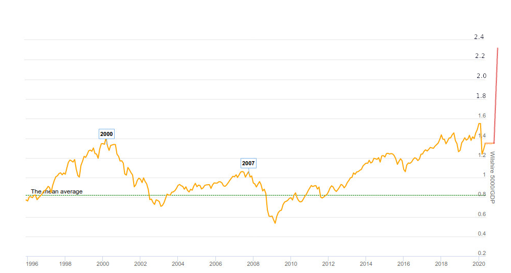
In our April 19 post entitled "All is Well! FAANG Stocks Hit All Times High as the Economy Collapses", we noted incredible disparities between the economy and the market. One of the metrics we used was the US market cap to GDP, aka the Buffet Indicator, which gives a sense of the valuation of the overall stock market (Willshire 5000) against the economy as measured by the GDP.

It was around 130& at the time, a level considered to represent an overvalued stock market, with 80% being fair-valued. As the stock market continued recovering, and the GDP "only" dropped by 4.8% in Q1 2020 for a total of 21.54 trillion dollars annualized, the ratio became slightly worse, and today it is at about 134%.


But once numbers for Q2 2020 come out, there will need to be adjustments. Either the stock market lowers to keep the ratio realistic, or it ignored the news, and the market cap to GDP goes to lalaland at levels never seen before... So what kind of scenario may happen? To find out we'll take the more recent Atlanta Fed GDPNow forecast for Q2 2020.

That would be a 42.8% drop (annualized). So If I understand correctly, we'd take the 21.54 trillion dollars mentioned in the introduction, and deduct 42.8% for it. Total: 12.32 trillion dollars or about the same amount of 2004 GDP.
Now that looks really bad, but it should also be temporary with massive jumps in GDP in Q3 and Q4 2020. If we get back to 18+ trillion dollars that would be a ~50% GDP growth over two quarters. Still significantly lower than previously,  but that should allow some politicians to boast about economic performance...

What would that do to the US market cap to GDP ratio, if stocks were to stay at the current levels? We already have the estimated GDP (12.32 trillion), so we need the Wilshire 5000 market cap that is 28.77 trillion (courtesy of Ycharts).

That a cool ratio of 233% market cap to GDP... Let's represent this on a chart...


Beautiful! Although it's temporary, as it will come down as GDP eventually increases significantly once economies reopen.

Let's look at scenario two, where stocks magically adjust to the new GDP number. That one may not be quite realistic because markets are supposed to adjust themselves to future outcomes, although the markets have not been very good at it. But anyway, a 134% ratio would mean the Wilshire 5000 would drop from 28.77 trillion to 16.50 trillion, or a 42.6% drop.

Since most people don't follow the Wilshire 500, let's apply the 42.6% drop to the S&P 500 index at 2,863.70 points on May 15. That would make it drop to 1,643 points.

Q2 2020 GDP first official estimate is supposed to be released in July 2020, hence the strange shape of our chart. Note at 134% TCM to GDP, the stock market would be vastly overvalued if we ignore future GDP growth.

But let's take a more realistic scenario that assumes the Federal Reserve does not completely go crazy with the money supply. We would get back to 18 trillion GDP, with a fairly valued stock market (and fairly pessimistic investor sentiment) at 80% of GDP. In this case, the Wilshire 5000 would have a market capitalization of 14.4 trillion dollars. That's even lower than our case above but spread over a longer period of time. Where would be the S&P 500 then, let's say in H1 2021? That's roughly a 50% drop, meaning the S&P 500 would be around 1,430 points, the Dow Jones under 12,000. I think you get the point, no chart needed...

Happy investing, and good luck!

Sunday, May 3, 2020

May 2020 - Is the Bear Market Rally Over?

When we discussed whether 2020 might be the Great Depression of 1929 All Over Again on March 22, 2020, we applied the monthly Dow Jones chart variations of 1929 to the chart 2020 and noticed there may be a rebound soon.
2020 Redux of 1929 Dow Jones chart

and the market indeed started to rally almost immediately, then we thought we might get back to around 23,000 points by May/June, and plateau there for a while...

We've gone beyond that level to almost 25,000 now as shown by the 3-month daily until May 1st. So it might be a good time checking out technicals again, as we all know fundamentals look horrible.


The red line above corresponds to the 61.8% Fibonacci retracement, a bearish technical indicator that could indicate the bear market rally may be over, and we may at least re-test the low.


If we look at the 14-day relative strength index (RSI-14), we can see a top at 59.76 on April 29, not quite oversold just yet, but close to the level we were on February 18, 2020 top (RSI-14 = ~65).


Individual investors are not overly bullish and stay bearing on aggregate with a -13.43% bull-bear spread, which means this rally may last a bit longer.


In "normal times", I'd have no problem shorting this market, but with Central bank involvement we simply don't know where's it's going. The BOJ (Bank of Japan) has been printing money for years, and it has not helped their market a bit, but if we turn our eyes on Venezuela, and the Caracas market, money printing does work... when it comes to boosting the stock market.

That's over ten times return on investment over one year, and 210.94% since the beginning of 2020 in local currency... But the Venezuelan BolĂ­var crashed compared to the US Dollar, and the country is suffering from hyperinflation, something that's highly unlikely in developed economies in the short term, but not completely impossible over the long term depending on central banks actions.

We still favor "sell in May and go away" for the S&P 500, Dow Jones, and most markets around the world.


Sunday, March 22, 2020

2020: The Great Depression of 1929 All Over Again?

Following the governments' responses to the threat posed by COVID-19, stock markets around the world have collapsed rapidly and entered bear markets. How does the 3-week drop compare to historical events in 1929 and 1987? Here's how
Source: ZeroHedge

As of March 20, the drop is faster and deeper than for the first 40 days of the crash of 1929, and faster, but not quite as bad (yet) that the crash of 1987. The October 1987 crash was a one-time event that did not affect the economy that much, but analysts expect some serious repercussions in the real economy with expectations of a 24% GDP contraction in the US and up to 12% worldwide in Q2 2020,

That's worse than the great depression, so we may expect similar results, especially we also started with an overvalued stock market. There's one important difference though: the policy response is now much different with central banks and government throwing money around like there's no tomorrow. This will likely not prevent deflation in the short term, but a long period of deflation is unlikely. With that out of the way, let's have a look at the chart of the Dow Jones index during 1929 and 1932 courtesy of MacroTrends.


I've marked the tops and bottom with respectively green and red dots. Bear in mind, this is a monthly chart so the data represents the end of month value, not the absolute tops or bottoms. The Dow Jones topped at 5686.69 in August 1929 before falling to 3572.79 points in November 1929, or a 37% drop in 3 months. It was followed by a bear market rally that topped at 4379.05 in March 1930, a 22.5% increase. Then the market "slowly" collapsed to 814.82 over the course of 2 years a massive collapse of around 82%. If counted from the top of 1929, the stock market dropped by 85.6%.

While I don't believe the exact same scenario will happen, let's see how low the Dow Jones would have to fall to match the same pattern as in 1929.

The Dow Jones reached a top of 29,551.42 in February 2020. A 37% drop over three months would mean a Dow Jones valued at around 18,600 in May 2020. We are almost there though after a little over three weeks with 19,173.98 points. So we may not have to wait that long for a dead cat bounce. With a percentage gain of 22.5% that would bring us to around 22,800 points in the next three to four months or May/June considering a rebound starting as early as March. Under our scenario, it may stay at this level for a while, and then for whatever reason (second wave of COVID-19?) collapse to depression levels by May/June 2022: That would be 4,104 points, even lower than the market low of 6,469.95 reached on March 6, 2009. Put it that way it does not seem as impossible. Is it likely? Maybe not, as it would mean all that money created out of thin air would go in other assets than the stock market. Charles Nenner has been forecasting a market bottom at 5,000 points based on his work on cycles so it's not so far off.

So I've created a virtual chart of the Dow Jones with the data points above, and a slightly compressed schedule with the bottoming occurring in December 2021.
Dow Jones Simulation - Jan 2020 - Dec 2021

 It's not a prediction, just a simulation of what the next two years would look like if the Global Great Depression of 2020 had indeed started, and would take a path similar to the great depression of 1929. Hopefully, it's all wrong. Note that during market bottoms, the Gold price historically happens to match the Dow Jones price, so it would be at over $4,000 per ounce in our scenario.