Showing posts with label forecast. Show all posts

Sunday, June 14, 2020

Investing using GMO 7-Year Market Forecast

You should always check multiple indicators before investing in a particular asset class or country, and one of those I like to follow is Jeremy Grantham's GMO 7-Year market forecast based on "return-to-the-mean" valuations.

The latest was published on April 30, 2020.

GMO 7-year Forecast April 2020


That means large U.S caps should return a real negative 3.6% per year over the next seven years with 2.2% US annual inflation. Or around negative 1.4% per year once inflation is taking into account, while emerging stocks should return 3.5% per year plus inflation (no assumption for non-US asset classes).

So how well does not indicator actually work? It's clear it's not an exact timing tool, as it will likely be incorrect during a bull market, and become right once a bear market occurs. But let's check about past 7-year forecasts, namely:

  1. GMO 7-year forecast Q1 2011 with a -2.8% annual return forecast for small U.S caps.

  2. GMO 7-Year Asset Class Forecasts - October 2012 with a -0.3% annual return forecast for large U.S. caps.

I'm not sure which indices GMO is using exactly, but I'll go with the S&P SmallCap 600 Index (S&P 600) and Dow Jones Industrial Average (DJI) respectively.
S&P 600
Source: Investing.com

The S&P 600 was at 457.95 points on April 1, 2011. With a -2.8% real annual return, plus 2.2% inflation, the S&P 600 should have been at 439 points on April 1, 2018 with a return to the mean. But the actual level of the S&P 600 was about 947 points.It still did not happen two years later, but maybe latter the year, or next, as the US market is very much overvalued.

Let's switch to the Dow Jones now for October 1, 2012 and October 1, 2019.
Dow Jones 2012-2019

The Dow Jones was at 13,096 points on the October 1, 2012. A -0.3% real annual return with 2.2% inflation would mean the index should have been at
14,960 points on October 1, 2019 assuming a return to the mean. Actual Dow Jones level on October 1, 2019: 25,605 points. It did not work too well either for large caps, but I believe that's yet another indicator that US stocks are vastly overvalued. How long the craziness will last is for anyone to guess.


Sunday, May 31, 2020

The Case for Stocks Going Higher - Retail Investors are Still Bearish

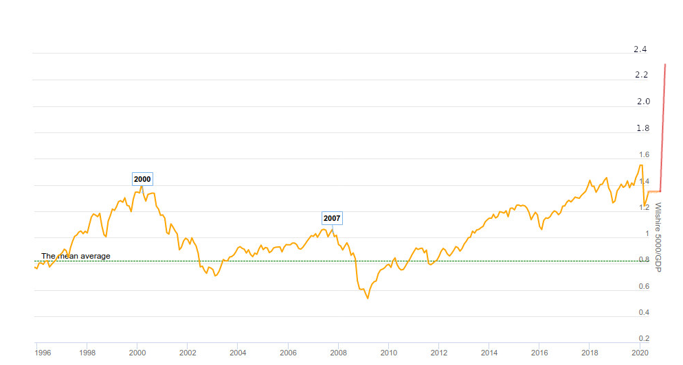
As we covered previously, there are plenty of metrics screaming the US stock market is in lalaland as one of the most overvalued markets (even before COVID-19), a complete disconnect between the economy and the stock market with the Wilshire 5000 to GDP ratio - aka Buffet Indicator - expected to reach around 230% by the end of July with the first Q2 GDP numbers.

When we asked whether the stock market rally was over on May 3rd, we noted the 1929 stock market rally took several months and our 1929 Redux simulation would take to it to May/June. We also pointed out one metric suggested it may have more legs: the AAII sentiment survey, or the bullishness/bearishness of the retail investor. We did not look into it too much at the time, so let's do that today by first looking at a 1998 to 2015 chart of the AAII bullishness 8-week moving average data courtesy of investing.com.


We can see every time the chart sharply drops below 25% it has been a buying opportunity. If you don't quite remember what the S&P 500 looks like for the period I have reproduced it below...

There were plenty of times when the ratio went under 30% between 1988 and 1994, and if you had purchased stock during that period you would have done well. Same thing for 2003 and 2009. In 2015, stocks may have looked overpriced, but the index was at around 2,000 points, and in May 31, 2020, the index is priced at around 3,000 or a 50% gain.

So what does the 8-week moving average of the AAII bullish sentiment index looks like today? Ycharts provides a free 5-year chart updating weekly for use to check.


At the time of the 2016 presidential election, the index was at 25%, a buying opportunity based on this index. But at the time, I was personally really wary of buying US stocks considering the length of the bull market, and other metrics.

What about today? The index stands at 29.50%, so retail investors are fairly bearish although not extremely so. Almost everything else cries "sell!!!", but the AAII sentiment survey tells me to wait a little longer, or strangely enough there should even be a buying opportunity, but I'd like to give it a pass.

Also, remember that's a presidential election year in the US, so politicians in power won't be shy to spend money they don't have, as we've seen in recent months in order to keep the system going, and are greatly helped with the federal reserve with their unlimited buying power.  Could they just throw enough money at the system to keep it going for 5 more months until the election? I don't know but would not rule out the possibility.

While AAII sentiment survey looks useful to spot buying opportunity, it does not seem to be a good timing indicator for selling stocks. In 2000, it works, but was completely useless for the 2007 peak, and would have made people sell their stocks later in 2004, and in 2011 with bull markets in their early stages.


Sunday, May 17, 2020

US Market Cap to GDP Forecast: 230% in Q2 2020

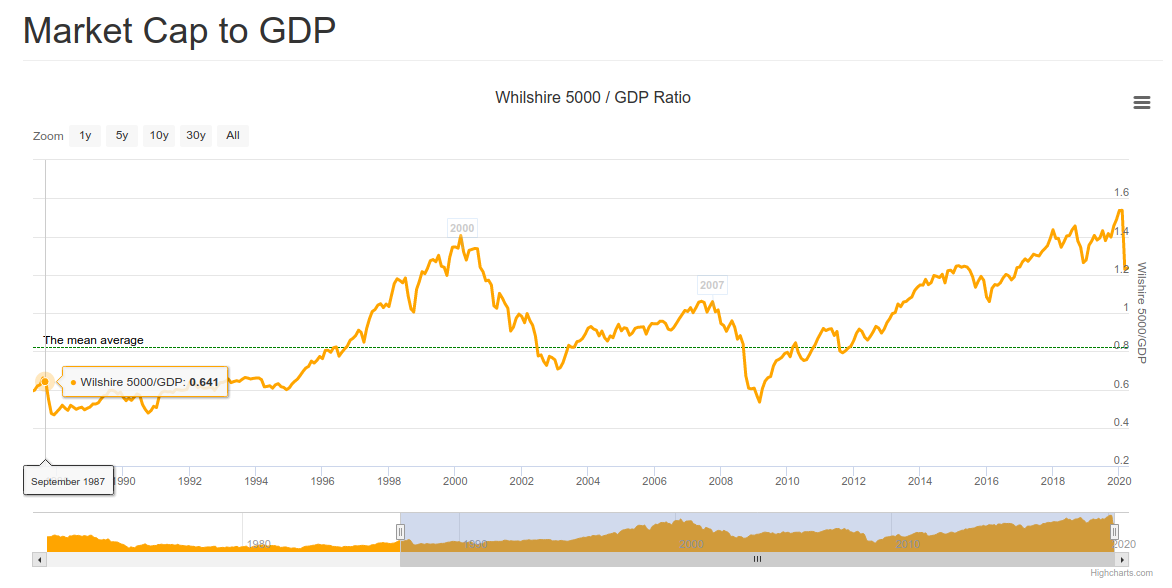
In our April 19 post entitled "All is Well! FAANG Stocks Hit All Times High as the Economy Collapses", we noted incredible disparities between the economy and the market. One of the metrics we used was the US market cap to GDP, aka the Buffet Indicator, which gives a sense of the valuation of the overall stock market (Willshire 5000) against the economy as measured by the GDP.

It was around 130& at the time, a level considered to represent an overvalued stock market, with 80% being fair-valued. As the stock market continued recovering, and the GDP "only" dropped by 4.8% in Q1 2020 for a total of 21.54 trillion dollars annualized, the ratio became slightly worse, and today it is at about 134%.


But once numbers for Q2 2020 come out, there will need to be adjustments. Either the stock market lowers to keep the ratio realistic, or it ignored the news, and the market cap to GDP goes to lalaland at levels never seen before... So what kind of scenario may happen? To find out we'll take the more recent Atlanta Fed GDPNow forecast for Q2 2020.

That would be a 42.8% drop (annualized). So If I understand correctly, we'd take the 21.54 trillion dollars mentioned in the introduction, and deduct 42.8% for it. Total: 12.32 trillion dollars or about the same amount of 2004 GDP.
Now that looks really bad, but it should also be temporary with massive jumps in GDP in Q3 and Q4 2020. If we get back to 18+ trillion dollars that would be a ~50% GDP growth over two quarters. Still significantly lower than previously,  but that should allow some politicians to boast about economic performance...

What would that do to the US market cap to GDP ratio, if stocks were to stay at the current levels? We already have the estimated GDP (12.32 trillion), so we need the Wilshire 5000 market cap that is 28.77 trillion (courtesy of Ycharts).

That a cool ratio of 233% market cap to GDP... Let's represent this on a chart...


Beautiful! Although it's temporary, as it will come down as GDP eventually increases significantly once economies reopen.

Let's look at scenario two, where stocks magically adjust to the new GDP number. That one may not be quite realistic because markets are supposed to adjust themselves to future outcomes, although the markets have not been very good at it. But anyway, a 134% ratio would mean the Wilshire 5000 would drop from 28.77 trillion to 16.50 trillion, or a 42.6% drop.

Since most people don't follow the Wilshire 500, let's apply the 42.6% drop to the S&P 500 index at 2,863.70 points on May 15. That would make it drop to 1,643 points.

Q2 2020 GDP first official estimate is supposed to be released in July 2020, hence the strange shape of our chart. Note at 134% TCM to GDP, the stock market would be vastly overvalued if we ignore future GDP growth.

But let's take a more realistic scenario that assumes the Federal Reserve does not completely go crazy with the money supply. We would get back to 18 trillion GDP, with a fairly valued stock market (and fairly pessimistic investor sentiment) at 80% of GDP. In this case, the Wilshire 5000 would have a market capitalization of 14.4 trillion dollars. That's even lower than our case above but spread over a longer period of time. Where would be the S&P 500 then, let's say in H1 2021? That's roughly a 50% drop, meaning the S&P 500 would be around 1,430 points, the Dow Jones under 12,000. I think you get the point, no chart needed...

Happy investing, and good luck!

Sunday, April 19, 2020

All is Well! FAANG Stocks Hit All Times High as the Economy Collapses

The economy is in shamble with predictions of 20%+ drop in Q2 GDP and so far 22 million people filing for unemployment in the US in the last four weeks, but the market acts as if nothing happened with the NASDAQ positive for the year.
A lot of it as to do with the various government stimulus, FED balance sheet going through the roof, as well as more demand from companies providing services for the many "work from home" (WFH) workers due to lockdowns.

But if we look into the details it's not that pretty, as FAANG stocks are responsible for most of the rise. In other words, it's not a broad market rally, and many NASDAQ stocks are still way down.

From a historical perspective, most bear markets will have a bear market rally, as shown from the S&P 500 chart below between 1998 and 2020. Source: NorthmanTrader.


You could always say "but Dark Horse, 2020 won't be like the great depression, and instead, it's just like 1987, we had the "best economy ever" and it's all up from here after everybody goes back to work + FED put!". To that argument, I'd answer the market was not overextended in 1987 as shown by the market cap to GDP ratio aka "buffer indicator".
Before the crash in 1987, the market cap to GDP was just 64%, and now it's around 130% before dismissal GDP numbers are announced meaning it should be above the previous record soon.

I'm a big believer in mean reversion of things like market cap to GDP and PER ratio / CAPE ratio. We previously wrote how many markets were overvalued including the US markets, and GMO just released their quarterly update with their expectations of yearly returns for various markets over a 7-year period.

That means large US stocks may lose around 1.5% a year over the next seven years, not a nice proposition especially when considering those numbers were after the correction in March 2020. Also note bonds don't look to be a good place to hide either, but emerging value stocks have some good prospects, and we previously mentioned that Chinese commodity producers may be a place to look for investment opportunities.

I'd still stay very prudent here as there are many risks around. We are quite surprised people expect a vaccine by 12 to 18 months, as we would like to remind our readers that some virus-induced diseases don't have a vaccine, think AIDS or dengue fever. The latter is even scarier because you don't develop immunity, and instead, the risk of death is greater the second time, and even more the third time. There have been reports that released COVID-19 patients have contracted the disease again, so herd immunity is not even a given, but so far there's no indication that the second infection is nastier like for dengue fever.

Stay safe! We live in scary times for our health, finances, and freedom from governments.

Tuesday, February 25, 2014

Global Oil Market Forecasting: Oil Companies Cut on Capex due to Low Oil Price

Eye opening presentation about oil market forecasts. In the last few years, oil companies spent an increasing amount of money for exploration and discovery, but as the price of oil is more or less stable, their operation starts to become less profitable, so they have started to reduce spending, and sell assets in order to be able to pay dividends. Most companies need crude oil at $100 or over in order to be profitable, with Petrobas needing $150 per barrel.


Source: http://energypolicy.columbia.edu/events-calendar/global-oil-market-forecasting-main-approaches-key-drivers

Nice summary @ http://ourfiniteworld.com/2014/02/25/beginning-of-the-end-oil-companies-cut-back-on-spending/

Wednesday, June 20, 2012

GMO 7-Year Asset Class Forecasts - May 2012

GMO has just released its monthly 7-year Asset Class Forecasts and the expected annualized returns  for international and emerging markets have greatly increased:
  • US Large caps: 0.8% per year
  • US Small caps: -0.5% per year
  • US High Quality: 4.8% per year
  • International Large caps: 6.1% per year
  • International Small caps: 5.3% per year
  • Emerging Markets: 6.7% per year
Emerging markets and internal large caps could even produce pretty decent returns. On the other hands, bonds are still a disaster with expected returns between -2.1% to 0.8% per annum.

One way to act on this forecast is to buy iShares MSCI BRIC Index (BKF).

You can receive GMO's monthly forecasts and the quarterly newsletter by registering at http://www.gmo.com (It's free !).

Wednesday, December 14, 2011

Time to Buy Gold and Silver Again ?

Following up on my previous post "Is it Time to Get Back into Gold and Silver ?" at the end of September, it looks like we may again be at interesting levels for both Gold and Silver.

Let's see the Gold chart between June 2006 and December 2011. (Source: Boursorama)

The gold chart recently broke the trend it started in 2008. Having said that it is currently oversold according to with an RSI-14 of 27.50. This could then be a buying opportunity, but since gold broke the trend there may be more downside. How much downside? Let's see the 11-year chart to provide a forecast.

In that time frame, gold is still in an uptrend, and the level line of the channel shows support (around 1350), so Gold could potentially down to around 1400 USD. Currently is around 1570, so it would be approximately another 10% drop. So the downside is limited (provided the long term fundamentals and trends stay intact), it appear it could be a good time to buy more gold even though more downside it likely. It would however become a screaming buy around 1400 dollars. On another note, Gold price evolution may be linked to the S&P 500, as if the index falls below a certain level, say 1000, we are likely to see further quantitative easing (or similar).

Let's now study Silver. Here's the silver chart (via SLV ETF) between June 2006 and December 2011.

Silver has also just broken the trend it started in 2008, it is however not yet in oversold territory with a RSI-14 of 33.8. If SLV cannot rebound quickly, it could easily go back to the low 20s with a very strong support at 20. This kind of level would also mean Gold between 1200 and 1300 which I don't think we'll get to.

To conclude, if we don't go through a major market panic in the next few weeks, it might be a good time to buy some Gold and Silver, especially if you are fine with a potential further 10% correction in Gold and over 20% in Silver in the short to medium term and are confident in the long term fundamentals of precious metals.

Friday, April 15, 2011

Jeremy Grantham (GMO): -2.8% annual return forecast for small U.S caps

GMO has just released its monthly 7-year Asset Class Forecasts and here are the expected annualized return (based on valuation and historical earning growth):
  • US Large caps: -0.1% per year
  • US Small caps: -2.8% per year
  • US High Quality: 4.6% per year
  • International Large caps: 3.2% per year
  • International Small caps: 0.2% per year
  • Emerging Markets: 4.3% per year
Different kinds of bonds are expected to return between -0.7% and 1.7% per year.
Managed Timber (how to invest in this?) is expected to return 6% per year.
Those are real returns adjusted for inflation of 2.5% per year.

You can receive GMO's forecasts (monthly) and the quarterly newsletter for free by registering at http://www.gmo.com